Personal Project
Netflix App
Revamping the Netflix Experience: A UI Redesign Journey with a Dash of UX Fixes.
UI Focused
App Design
Tools used

It’s good but lets make it great!
Because we can...

Netflix is entertaining the world with a wide selection of movies and tv shows. I wanted to have a look at the app itself and see what I can do make this an even better experience for everyone!
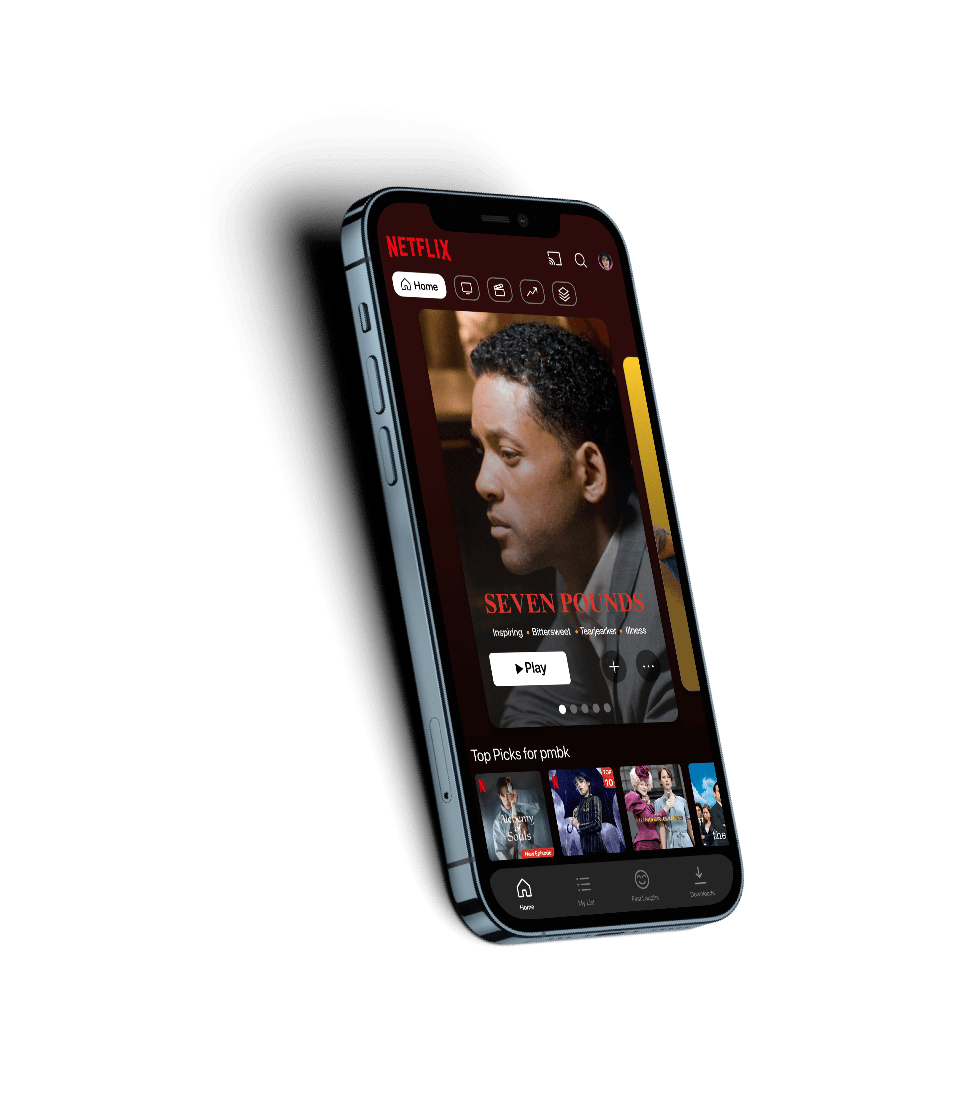
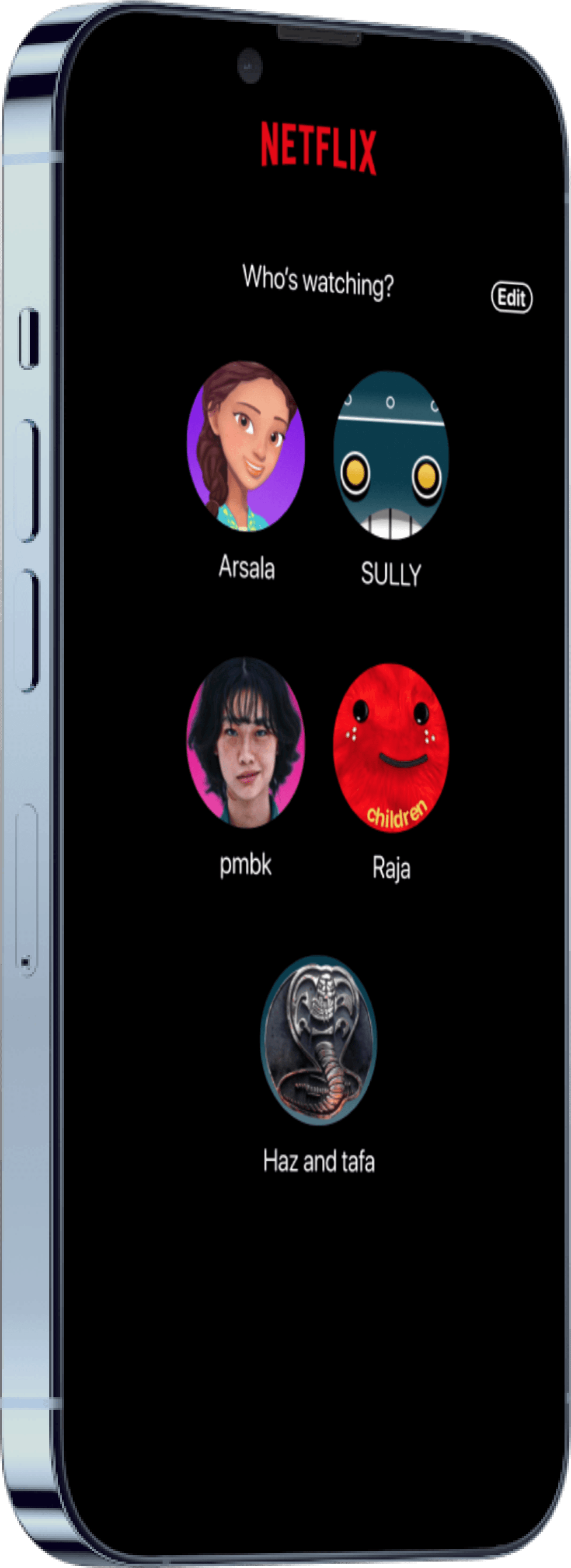
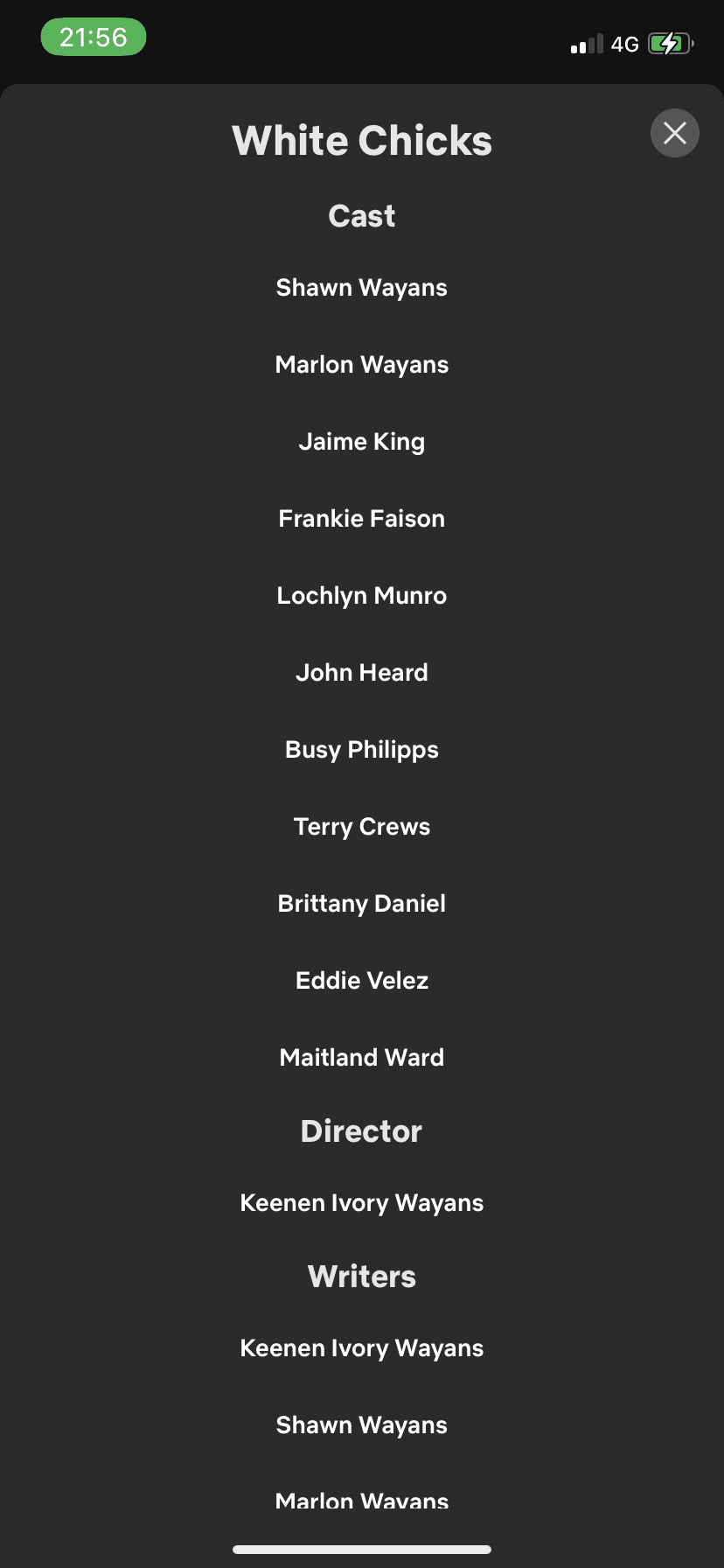
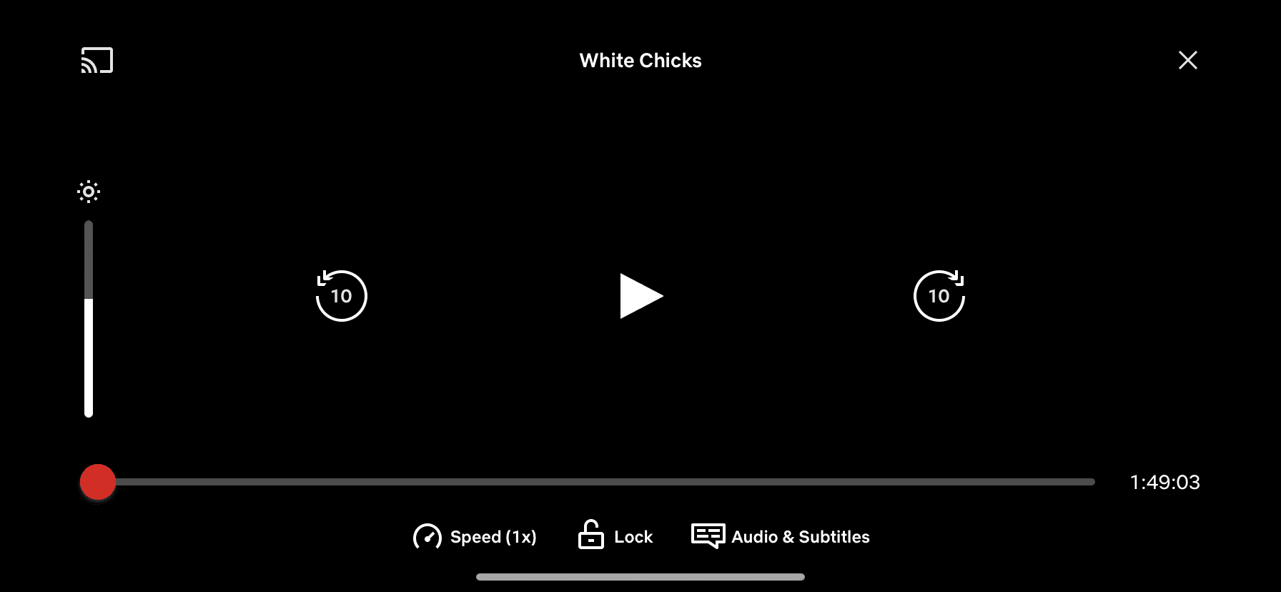
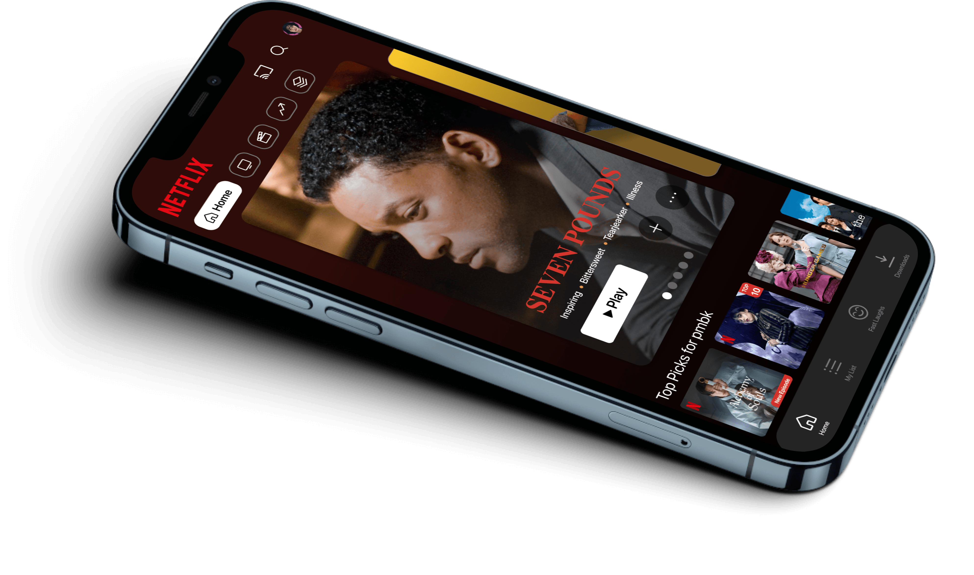
Current Screens (AKA the boring screens)
Background gradient is dull
No clear indication how to access watchlist
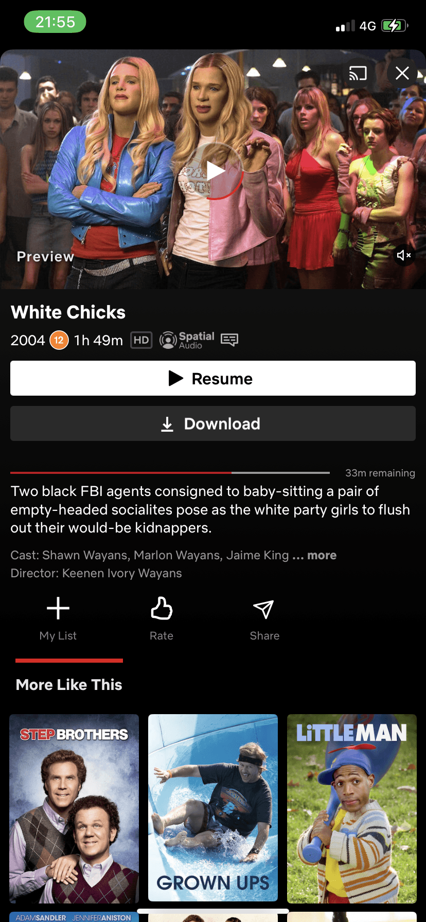
No additional information provided on advertised movie.
Seems a little cluttered
Autoplay preview is annoying
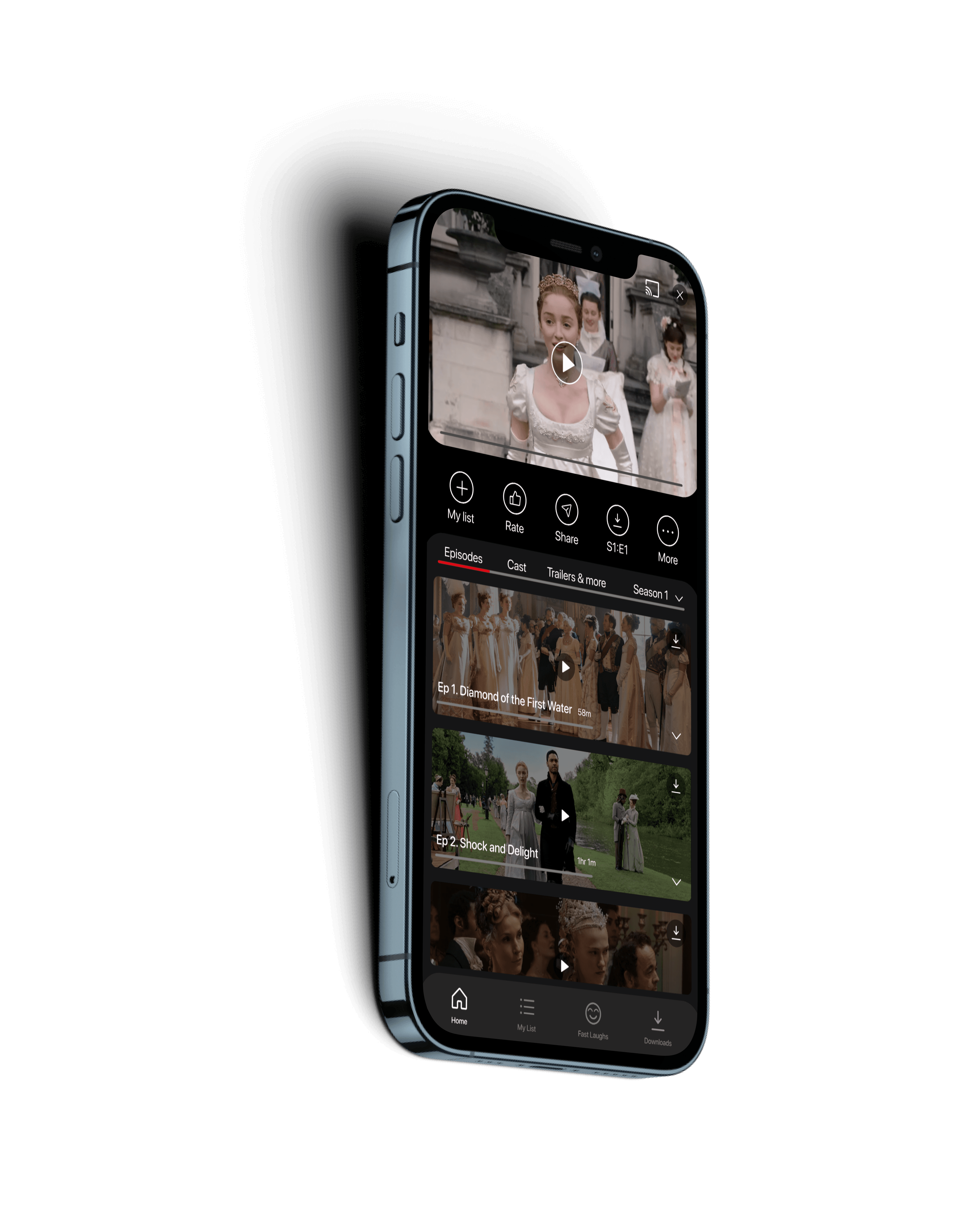
Some information seems useless to state
Would prefer larger icons for episodes
Would like a footer tab still available for easy use
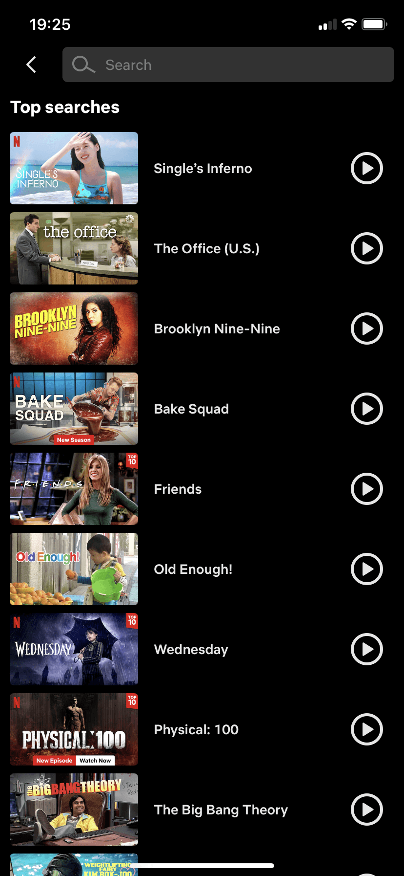
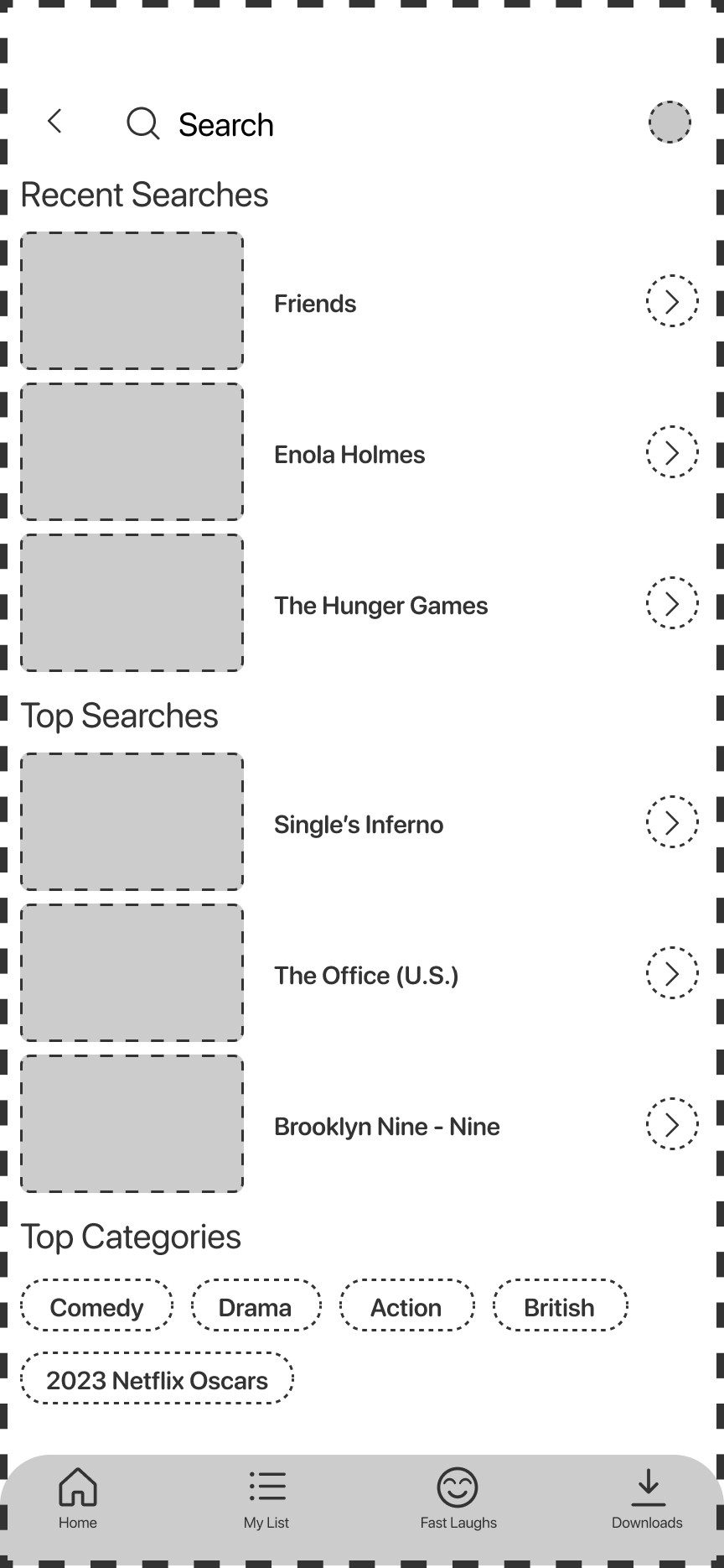
No way to look at recent searches
Misuse of play icon as it leads to the previous screen instead of playing.
Would like more options than just top searches.
Would like a footer tab still available for easy navigation
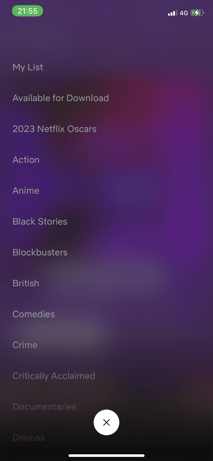
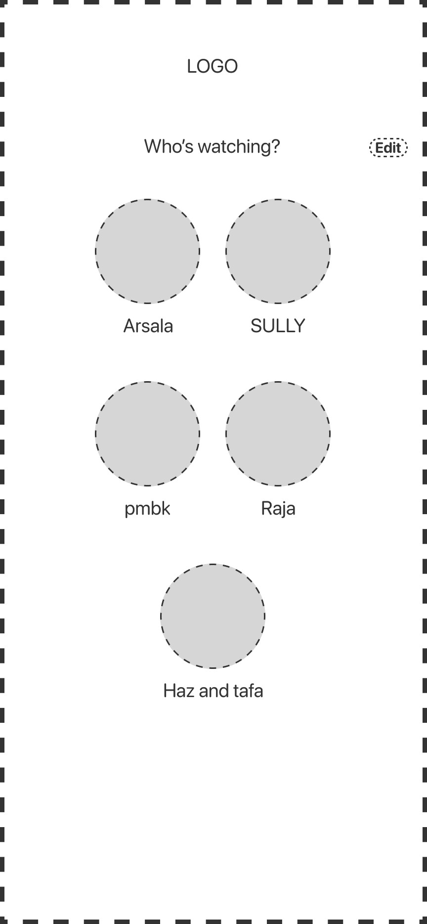
Not a clear header
Hard to see “Edit” button
The Netflix App is good but let’s make it
G
R
E
A
T
Lets add some something extra to make our lives easier
Icons
Lets add some something extra to make our lives easier
Icons

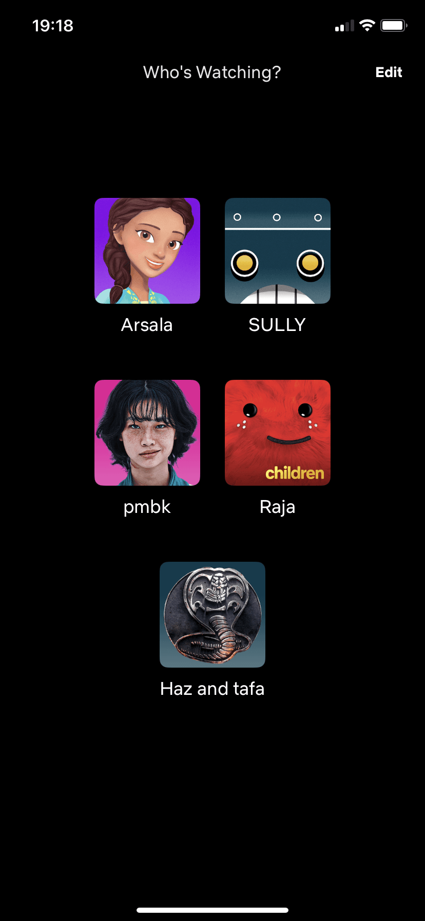
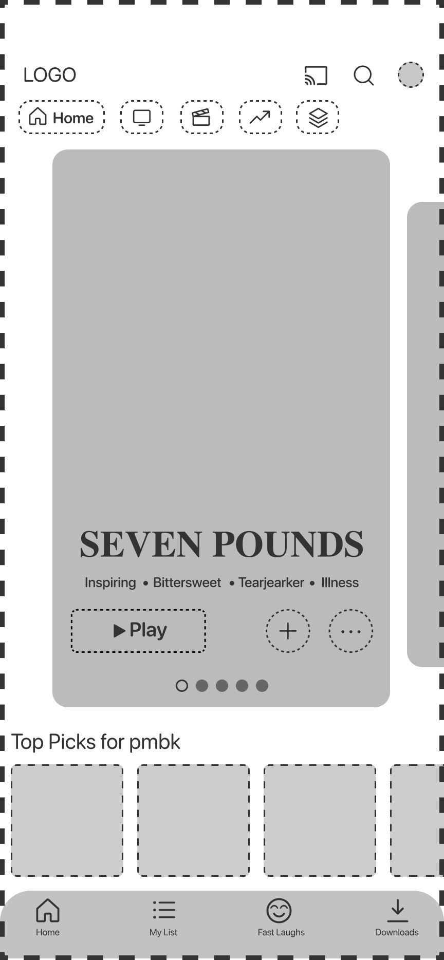
Maximise!
Let’s use the space we have and have the phone outline the app itself. The images are now bigger and fall easy on the eye.
0 margins for clean look
Effective use of icons
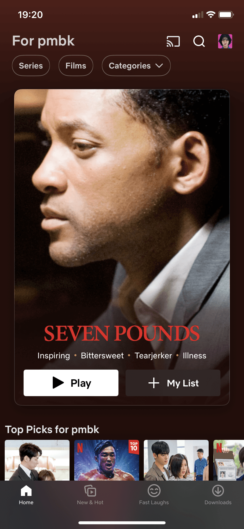
More recommended shows/movies (swipe through)
Minimal text! It’s about the quality
Clear Logo
Footer with access to “My List”
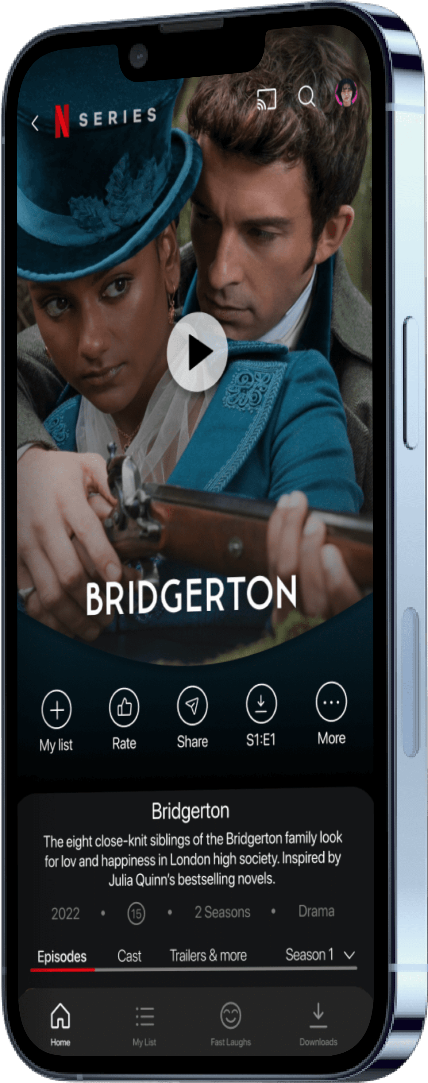
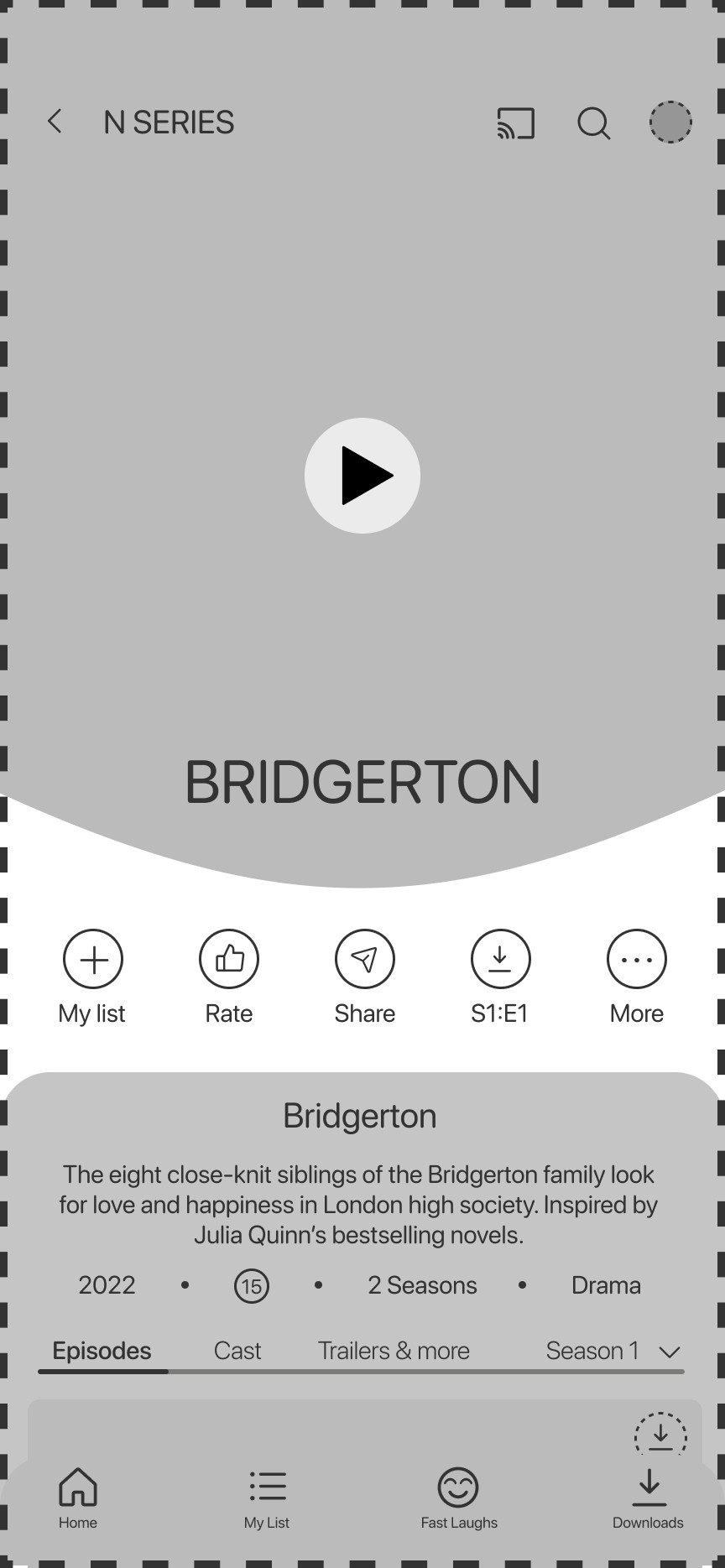
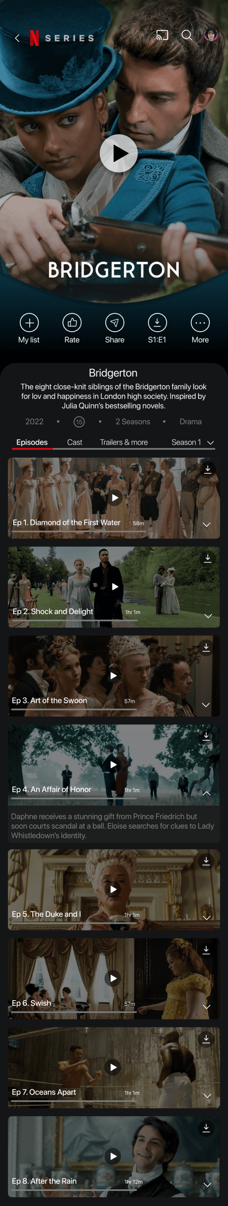
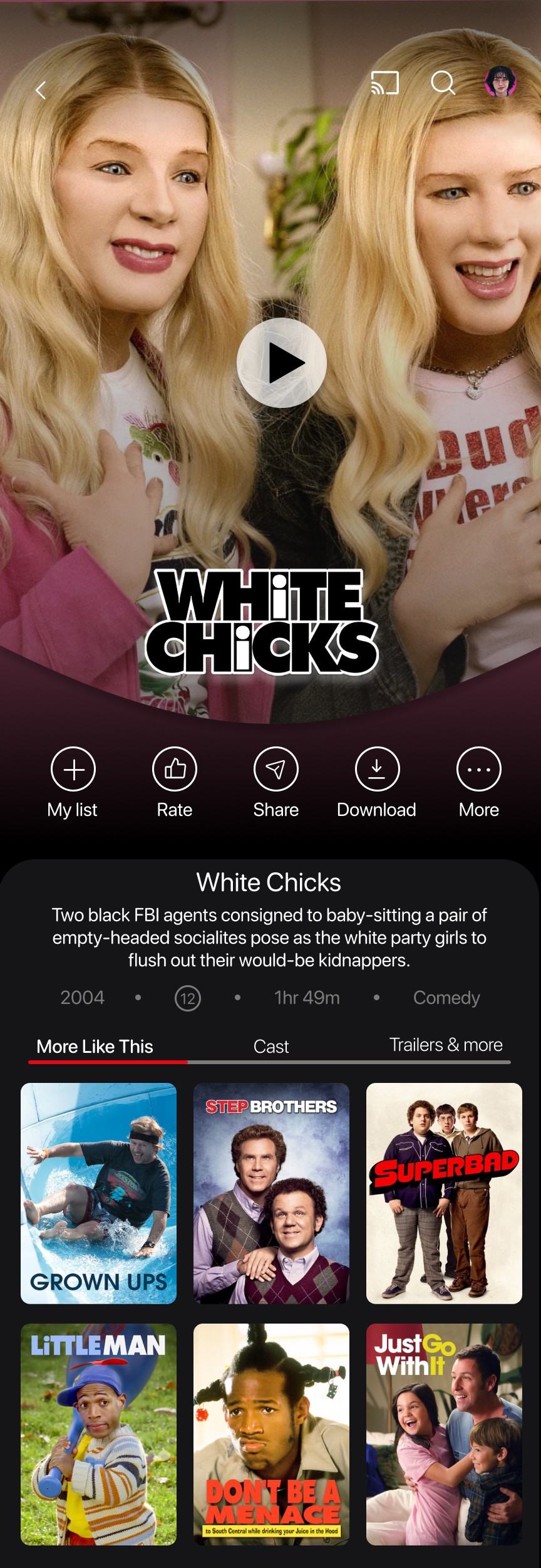
The New and Improved Movies/Shows Page
Clear Icons
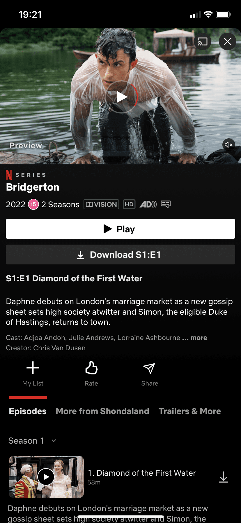
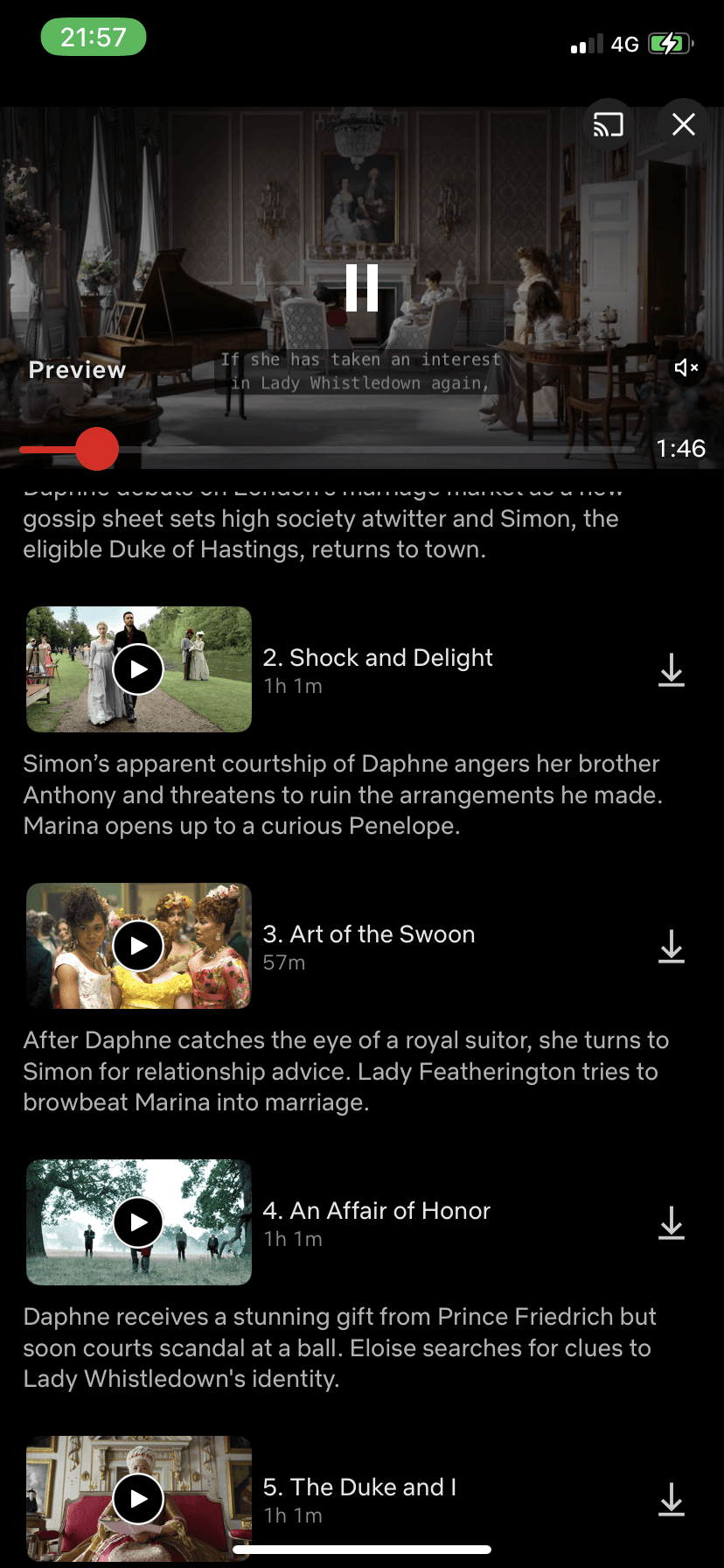
Drop down for more info on each episode
Full width images
Clear indication of tab selected
Footer with access to “My List” ALWAYS
Hooray to no more automatic previews!
Clear icons for ease of use
Minimal text
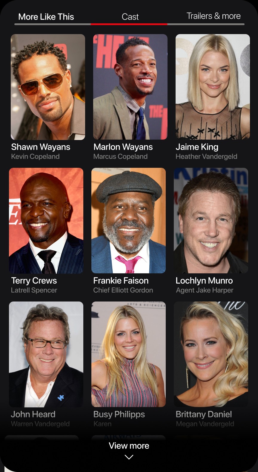
Separate tabs for Cast, trailers, etc.
Cast shown with images and character names
Kept original concept of showing “more like this”
One clear play button to reduce space and positioned for quick clicks
Logo and back button instead of “X”
Tap the arrow to reveal a synopsis of the episode
Padding around icon to make it a clear button for users to click on
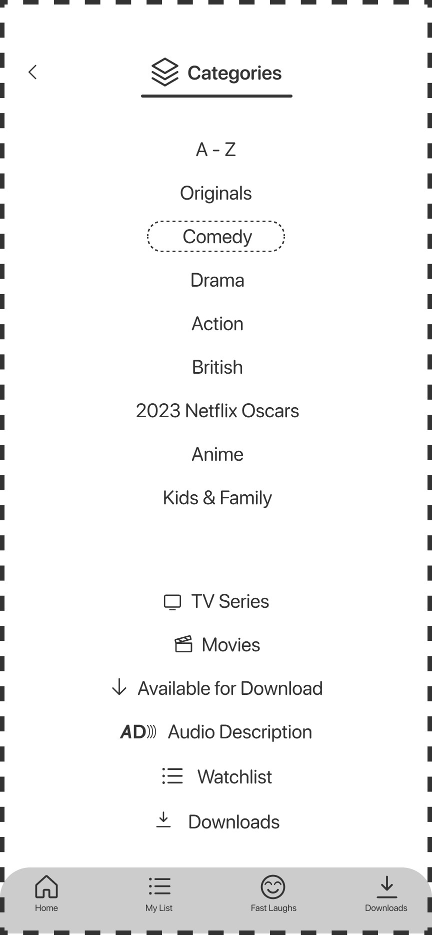
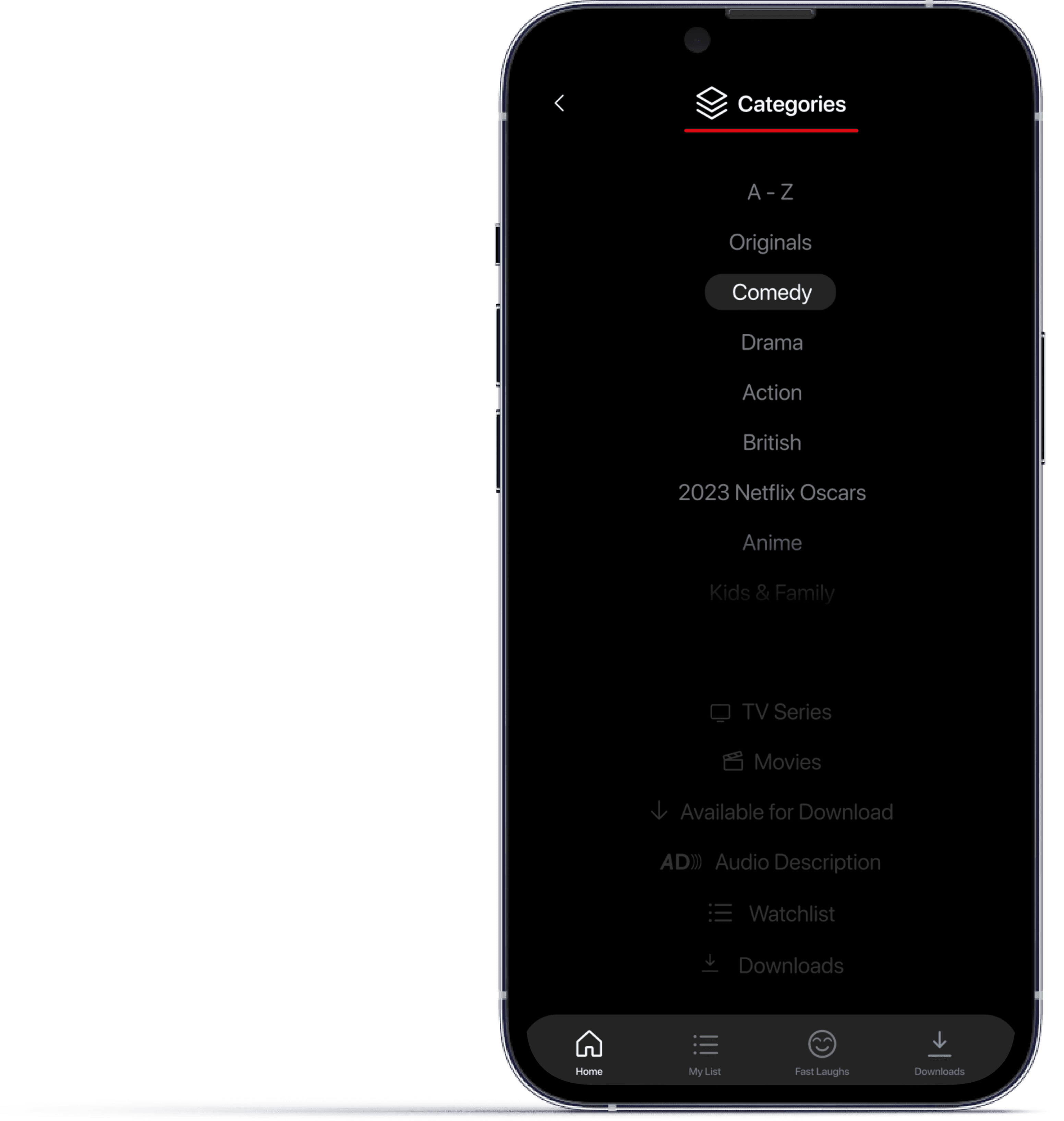
A clean and easy to use categories page this time.
Scroll category list with genres and an A-Z option
Quick access to TV series and movies at the bottom
What is available for download
Access to all options on the footer
Back button in similar position throughout app
Lets add some something extra to make our lives easier
Icons
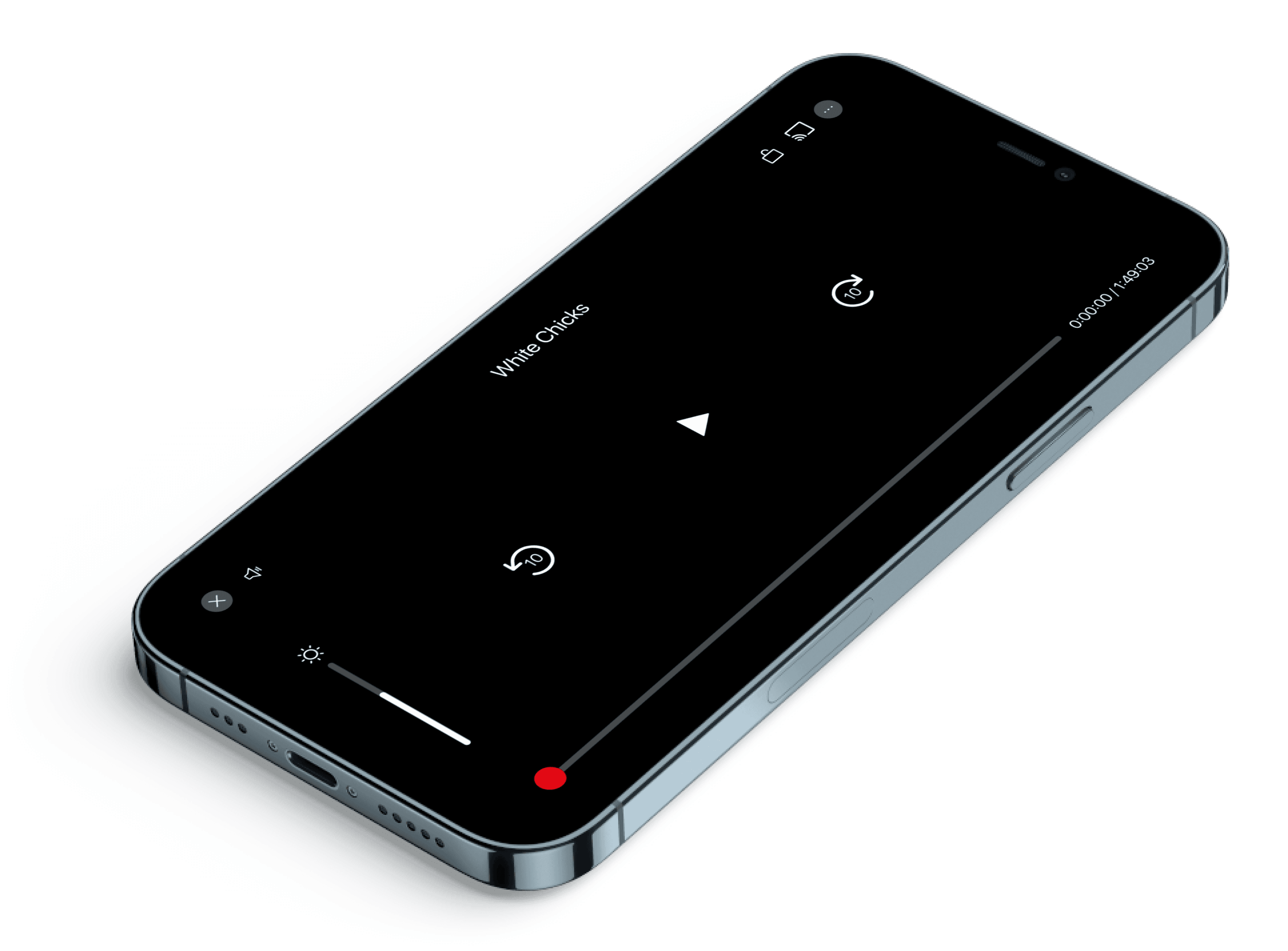
More information with access to subtitles, audio info etc
The “X” and screen share icon have swapped sides to keep consistent with other screen layouts
Quick click to mute when needed.
Time stamp with current and overall duration
A video player we all would love
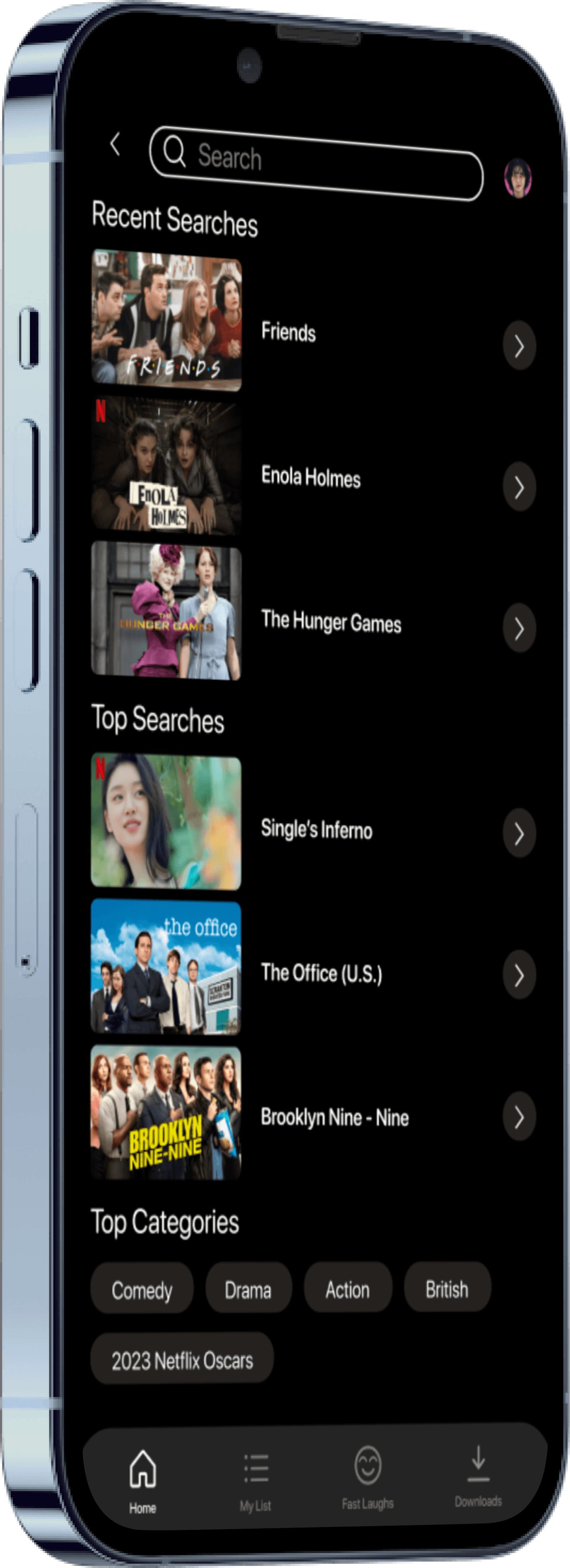
A search page that is actually useful!
Recent searches is now available!
An arrow icon instead of play
Top Categories shown at bottom

(I am always down for a cup of coffee)
🫱🏼🫲🏽 Let’s be friends!
eBeesSolutions